
Introducing our Reimagined Brand: Unveiling the Community Foundation’s New Mark
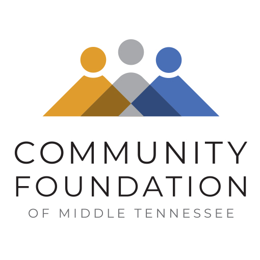
At the Community Foundation, we are thrilled to present our revitalized brand that encapsulates the essence of our dedication to connecting generosity with need. The new logo showcases a symbolic Three Hills, inspired by the visually abundant rolling hills of Middle Tennessee.
These Three Hills reflect the critical partners of CFMT’s work: our Donors, represented by the radiant gold color, embody a spirit of generosity; our Nonprofit partners, depicted in soothing blue hues, reflect an unwavering dedication to making a difference; and our shared Community, shimmering in silver tones, which represents the heart and soul of the Foundation’s endeavors.
The logo narrates a compelling tale. When Donors and Nonprofit partners unite, their collaborative actions can transform the Community they deeply care about. The interlocking shapes in the new logo symbolize CFMT’s commitment to bridging the gap between Donors and Nonprofit partners, echoing our motto of “Connecting Generosity with Need®.”
While we take pride in our continued efforts to understand the communities we serve, we know our work is never done. Some may perceive the challenges we face as a community as insurmountable mountains. However, through collaborative efforts with Donors, Nonprofits, and Community partners, we will continuously work to unite our collective resources and expertise to transform these mountains into rolling hills.
Through our renewed commitment to fostering connections, we embrace the dynamic landscape of Middle Tennessee, where visually abundant rolling hills inspire us to overcome obstacles and build a stronger, more prosperous community for everyone.
A special thank you to Tom Davis (tdaviscreative.com) on working with us on the bold new brand.